Campaign Analytics
The Campaign Analytics dashboard gives you a clear, centralized overview of how your outbound campaigns are performing. It helps you track task progress, call outcomes, and key performance metrics in one place.
1. Accessing the Dashboard
To view your campaign's performance:
-
Navigate to Campaigns under the "CALL" section on the left-hand sidebar.
-
Click on the specific campaign you want to analyze.
-
You will be taken directly to the Stats tab, which houses your analytics dashboard.
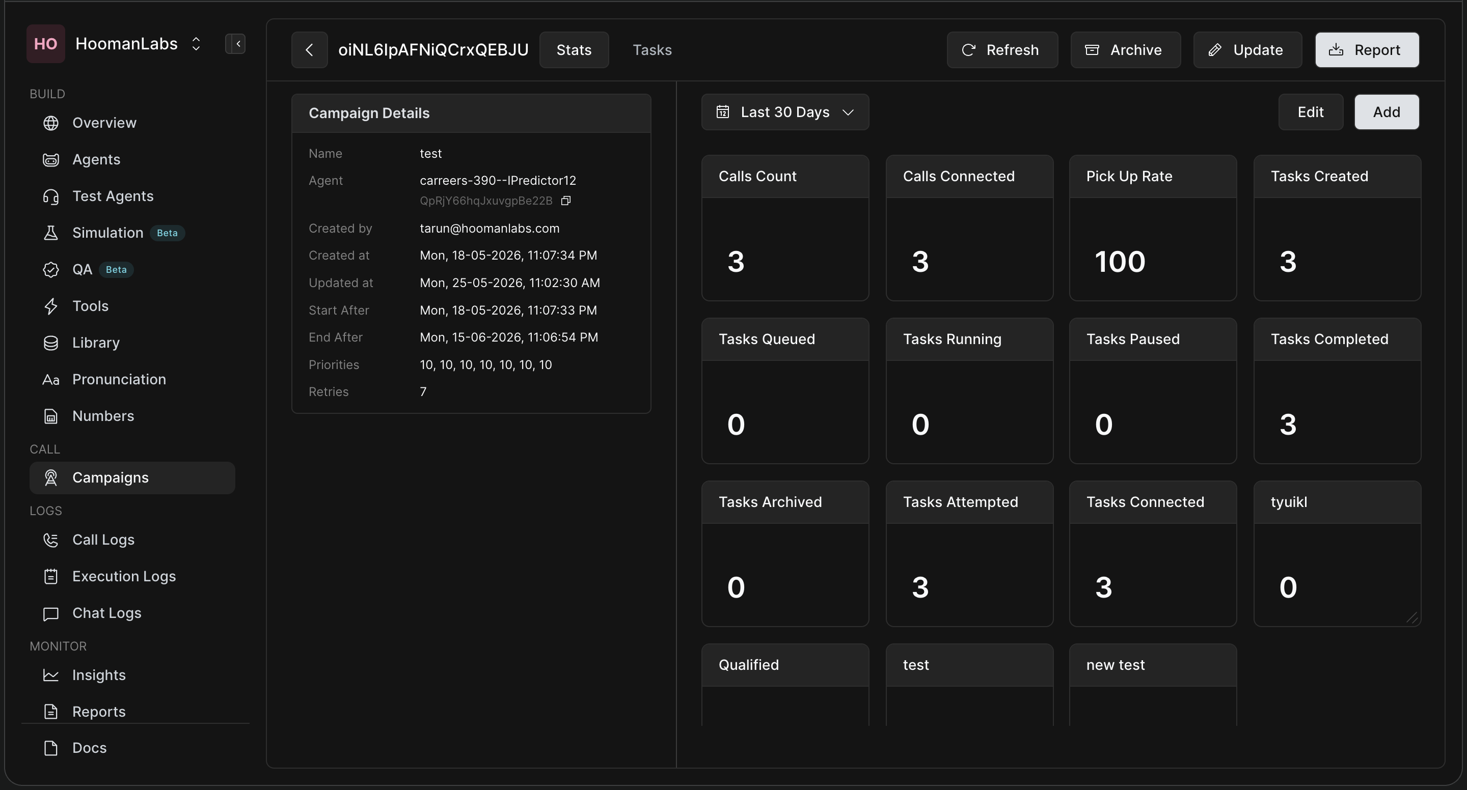
2. Understanding the Stats Interface
The dashboard is divided into two main sections:
-
Left Panel (Campaign Details): This shows the static configuration of your campaign, including the assigned Agent, creation dates, scheduling (Start/End After), priority levels, and the maximum number of retries.
-
Right Panel (The Dashboard): This is where your live data lives. You can use the date dropdown (e.g., "Last 30 Days") at the top to filter the time range for all the standard widgets below it.
Standard Metrics Explained
The default widgets give you an immediate health check of your campaign:
-
Tasks Created / Queued / Running / Paused / Archived: Shows the current pipeline status of the tasks within your campaign.
-
Tasks Attempted: The number of tasks where at least one call has been made.
-
Tasks Connected: The number of tasks where at least one call was actually picked up by the user.
-
Tasks Completed: The number of tasks that are finished (either the call was successful, or all retry attempts have been exhausted).
-
Call-Level Metrics: Track your Calls Count (total dials), Calls Connected, and your overall Pick Up Rate.
3. Creating Custom Widgets
Every campaign is different, so HoomanLabs allows you to build custom widgets to track the exact data points you care about. Custom widgets created here will be available across all your campaigns for easier unified analysis!
-
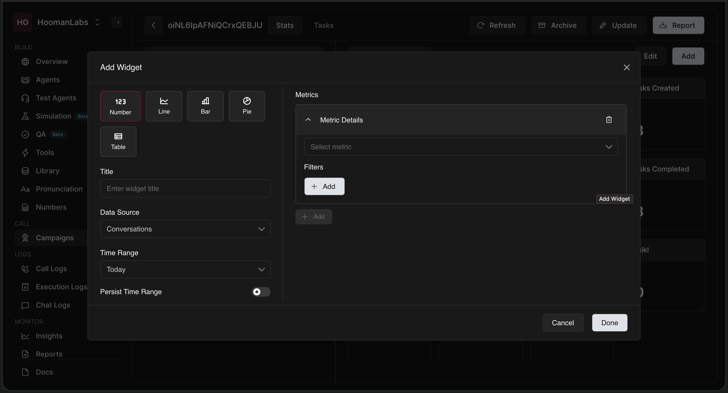
Click the white Add button in the top right corner of the dashboard.
-
In the Add Widget modal, configure the following:
-
Chart Type: Choose how you want to visualize the data (Number, Line, Bar, Pie, or Table).
-
Title: Give your widget a clear name (e.g., "Pickup Rate by Attempt").
-
Data Source & Time Range: Select where the data is coming from (e.g., Conversations) and the time window (e.g., Today). Toggle Persist Time Range if you want this widget to ignore the global dashboard date filter.
-
Metrics & Filters: Select the specific metric you want to track. You can add granular filters to narrow down the data.
-
-
Click Done to pin the widget to your dashboard.
(Example: If you want to see your pickup rate across different call attempts, you would select a Bar chart, set your metric to Pickup Rate, and use the filters to group the data by attempt.)
4. Deep Dive into Individual Tasks
If you notice a trend on the Stats dashboard and want to investigate further, simply click the Tasks tab (located next to the Stats tab at the very top). This will take you away from the high-level dashboard and provide a detailed, line-by-line breakdown of every single task within that campaign.
Frequently Asked Questions (FAQ)
Q: Can I export my campaign analytics?
A: Yes! In the top right corner of the dashboard, click the Report button to generate and download a report of your campaign's statistics.
Q: Will the custom widgets I build only show up for this specific campaign?
A: No. Once you create a custom widget, it is saved to your dashboard view and will be available to view across all of your other campaigns as well.
Q: How do I change the layout of my widgets?
A: Click the Edit button at the top right of the dashboard. This allows you to reorganize, resize, or delete widgets to customize your view.
Q: What is the difference between "Tasks Connected" and "Calls Connected"?
A: A Task represents a single contact/lead. You might call that lead 3 times before they answer. In this scenario, your "Calls Connected" is 1, your "Calls Count" is 3, but your "Tasks Connected" is 1.